• The Blue Brick has grown beautifully, but with that come the necessary growing pains and we are long overdue for an overhaul to the way our store works. Increasingly long lead times have, completely understandably, led to frustration for folks awaiting their yarn packages. Ombre is not like tonal yarns, and I can only dye so many per day, limited by the size of my basement. We are so busy these days that we have made the extremely difficult decision to back out of Festival Twist this year, one of our largest and most enjoyable events, because we cannot prepare the stock while still looking after online orders. I confess to wanting to roll my eyes at everyone who has told me “it’s a good problem to have” (tell my customers that!).

    We’ve talked about an inventory based store before, and I have generally avoided it because I didn’t want to limit what folks could get. However, it’s finally time to reduce our online store to inventory-only. We are not there yet, we’re going colour by colour as we generate sufficient inventory, with the goal of moving almost all yarns to an inventory basis within the next two months.

    Special colours, heavy metal, sweater quantities and collection releases will still be dyed to order due to volume.

    Ombre:

    • All moving to inventory.
    • The following colours are still available but when sold out, they’re gone: Maple, Cape Spear, Wheat Kings.

    Tonal:

    • Sock, lace, and Muskoka luxe are moving to inventory. Escarpment DK and Tobermory worsted are being left as-is; because if you order a sweater or blanket quantity I will need to dye it all in the same batch. These items will still be dyed to order as a result. If you want a sweater quantity of another base please email us, and we’ll be happy to help you place the order.

    What does that mean for our customers?

    Pros:

    • If you were able to order it, it’s already on our racks and ready to be shipped.
    • Bases that I have only a few of, but don’t normally carry, such as MCN sock, or worsted gradients, can be added to the inventory.
    • My dyeing life will be simplified. Once the colours are all up to date I’ll be dyeing to top up inventory, and not to fulfill orders. This should make for a more streamlined process at our end.

    Cons:

    • If you order more than one of the same colour you may want to add a note to the order letting me know if they’ll be used in the same project. Otherwise you will get the two skeins on the wall which may or may not be a perfect match.
    • If there is a colour you want and it’s not in stock it won’t be available. In that case you can definitely write to us and inquire after either a custom order, or when we plan on restocking.
    • During busy times, after festivals, or when our suppliers are backed up, there may be shortages in the online store. We will our best to level these out so they don’t impact the customer.

    We hope that this new system will allow us to fulfill more quickly and reliably once it’s in effect. Again, it will take time to fully top up and switch over all the colours, with the goal being two months out.

    Thank you everyone, for your patience with us as we get over these growing pains. Hopefully the new system is more comfortable for everyone!


  • So far, I’ve stayed out of the discussion on IG about racism and inclusion in the knitting world. I’ve never made a secret of the fact that I’m brown in my posts, or that my family is multi cultural. I grew up in the diverse city of Toronto, and felt that I hadn’t really experienced racism in any meaningful sense. 

    I also personally didn’t connect with a lot of the rhetoric, which didn’t seem conducive to positive change, and in some cases felt tantamount to bullying. I’m all for education, not shaming. I’m all for that which unites us, and against that which divides. I wasn’t personally a fan of having folks who were obviously well-intentioned with their hearts in the right place feeling super guilty all of a sudden for the circumstances of their birth. Historically, I’ve had way more trouble being a woman than I have being brown, and I feel strongly that us ladies need to stick together.

    Then, at Stitches West, I overheard this conversation in the washroom (from a stall, they couldn’t see me).  It was two vendors discussing the show, totally normal, and then one vendor said: “I didn’t make as much money as usual. I think it’s because it’s a very ethnic group this year and it’s full of trash who aren’t spending any money”.

    I came out of the stall, and we immediately all looked at the floor. So, before you ask, I don’t know who they were or what companies they represent. I scrubbed my hands, face burning, and ran out of there.

    I don’t know what made me feel worse, that I internalized the humiliation, even though the comment wasn’t intended for my ears, or directed at me, or that I immediately began gaslighting myself on their behalf. “Did I really hear that?”, “Maybe they meant something else?”. 

    Then I thought a little harder about my own past; I remembered that I initially took up Karate, 25 years ago, because my family was targeted in a racially motivated hate crime at Scarborough bluffs. That was a Big Obvious Thing, where anyone would get it. But there were also small insidious things, and they’re harder to get.  I realized that downplaying hurtful things is a trend. 

    Every time someone asked me “where are you from really, after repeatedly being told that I was born and bred in Toronto. Every time someone joked that I was “practically white” and meant it as a compliment. That time I made small talk about the weather at a baseball game and was told “we don’t get cold, we’re Canadians”, as though somehow I wasn’t (effectively divesting me of the only country I have). Every time a friend has said something racist and then exclaimed “I don’t mean you! You’re different!”. Every time someone was surprised that I didn’t have an accent, or that I turned out to be brown in person after only talking on the phone. When Saks Fifth Avenue opened in Toronto I went looking for a dress for a wedding. A staff member politely told me “the Bay is that way”, assuming I was lost. The list goes on. 

    So now I think, I need to say something on behalf of both myself and others. And you know what? I don’t even know what that something is. Maybe it’s as simple as “Hey, this happened, and I can’t pretend that it didn’t”, or “Hey, the problem is real”.  Part of me also wants to say “If you’re reading this, I sold plenty to BIPOC shoppers, so maybe you just suck.”, (It’s petty, I know).  

    Worth noting: the incident was reported to the organizers and they had a funny feeling they knew who the vendor was. That kinda tells me they have done this before, or have a reputation for being racist, but seem to be getting away with it, which is the point I’m trying to make. {EDIT – It was not my intention to imply that the organizers were complicit in any way, they were in fact horrified, and issued a general message to all vendors, which I have shared below}. And no, it wasn’t reported by me because I was still feeling awkward and humiliated about outing them. That tells me something else, about the tendency to internalize hate and redirect it to ourselves. So when people trying to instigate change come off as excessively forceful, perhaps we should have a little empathy towards them before we judge. 

    Having said that, this is worth a read:

    https://medium.com/s/digital-trauma/how-woke-became-a-weapon-304f265282df

    “Plenty of activists argue that shaming those who err while striving to help build a resistance is a counterintuitive practice. “To organize such a movement necessarily means that it will involve the previously uninitiated — those who are new to activism and organizing,” writes Keeanga-Yamahtta Taylor, a Black female activist and author of From #BlackLivesMatter to Black Liberation, in a piece reflecting on critiques of the history-making Women’s March. “We have to welcome those people and stop the arrogant and moralistic chastising of anyone who is not as ‘woke’… [movements] are built by actual people, with all their political questions, weaknesses, and strengths.””

    Another great quote:

     Patrisse Cullors, a queer Black woman and co-founder of the Black Lives Matter movement, spoke about the downfalls of woke shaming in an interview with Complex last year. “Woke shaming is really unfortunate,” Cullors said. “If we are trying to build a movement to save all of us, we need to be able to invoke faith in people who are new, who are learning, and who are willing to grow. There is a difference between people who are bigots and people who are trying to figure out their way in this. We should have patience.”

    Regarding how we can do better, maybe it doesn’t need to be Big Obvious Things. It can be little helpful things. When my dad worked as a factory manager he would stand by the punch clock in the morning and learned to greet everyone in their own language. Something I’ve always respected him for. Something to model myself after.

    “Treat everyone with politeness and kindness, not because they are nice, but because you are.”
    Roy T. Bennett, The Light in the Heart

    S.


    ___

    on Thursday February 28th, the organizational committee of Stitches West issued the message below:

    Dear Exhibitors!

    Yesterday Shireen from The Blue Brick Dyeworks posted online about a very disturbing incident that happened at STITCHES West.

    Sometime during the event, Shireen overheard this conversation in the washroom (from a stall). It was two vendors discussing the show – and one vendor said: “I didn’t make as much money as usual. I think it’s because it’s a very ethnic group this year and it’s full of trash who aren’t spending any money.”

    We condemn, unequivocally, their rhetoric and their overt racism.

    I think it’s important that we don’t shy away from this. So if you want to read the full account, here is the link…

    https://thebluebrick.ca/2019/02/27/racism-its-a-thing/

    We have reached out and apologized to Shireen.

    We don’t know who these vendors are. And, in case anyone is unsure about where we stand on this, we want to be very clear about our policy on this issue… if we ever see or hear of this kind of racism at our shows from any exhibitor, we will remove them and their company from the market floor and our event, then openly tell the world why.

    Thank you for you time and attention.

    Benjamin Levisay
    CEO
    XRX, Inc – STITCHES Events, XRX Books, & stitchips

  • We’ve added a new tool to our website! Watch the video below to learn more :)

  • Holiday Kits – Everything you need to know :)

    Holiday kits are ready to roll out at last! Everything on this list is scheduled to ship before or on November 30th, which is hopefully ample time for holiday deadlines. All prices are in Canadian dollars and we ship worldwide for $12 CDN.

    How do you find all these things? At 11am EST tomorrow they will all hit the website in their own new section called “Holiday kits”. These products will be available until Monday evening at 9pm EST and then we take them down. As much as we’d love to, we won’t be able to accommodate late or custom orders while still hitting the holiday deadline, so you’ll want to set your clocks for this one ;)


    Let’s start with the 2018 holiday colour, “Sugar Plum”. Sugar Plum is rich and deep, transitioning from silver through purple-pinks to a warm reddish purple. It comes with its own pattern, the Sugar Plum cowl. The cowl requires one full 600 yard skein and one 150 yard twin, and it all ships together as a kit with a printed pattern. These kits will be $65 CDN each. You can choose between Merino/Cashmere/Nylon and Merino/Cashmere/Stellina if you prefer sparkles :)

    3V8A9619

    Next up on the list is our calendar. Earlier this year I had asked folks if they would be interested in prints of my yarn photography, and I received a lot of feedback asking me to combine prints with a calendar, so I took a lot of time to search out the largest size on the thickest cover stock paper I could find. The result is an 11×17 calendar on a lovely uncoated paper, single-sided so you can cut out and frame each month

    IMG_4666

    To protect the calendars, they will ship with cardboard backing and an extra protective bag inside an oversized mailer. Each photo has been curated carefully to provide a year of inspiration. Calendars will be $49 CDN each.

    Screen-Shot-2018-10-14-at-5.45.05-PM

    Lastly, our pendant/yarn combos. These were a blast to make! Because resin dyes and yarn dyes are not the same thing it was a challenge to recreate our colour ways, and I enjoyed the exercise and the change of pace. The results are shiny and detailed, a silver-plated “pewter” (zinc-based alloy) on an 18″ silver plated snake chain with hand painted resin designs protected by a thick coat of jewelry-grade resin for a perfect, glassy finish.

    Once you click on the colour you like, you will be prompted to choose the pendant you want from the list. Pendants will be numbered and you will get the exact one you order. Each one has been hand-poured and is one-of-a-kind, I couldn’t recreate the exact one  twice even if I wanted to ;)

    3V8A9717

    We tried to cover off as many of our popular gradients as possible. Each one comes packaged in a vinyl box with its yarn, caked and ready to use. The inserts include the yarn inspiration photo, base information and a download code for a free copy of our “Emy” shawl pattern. The yarn can be either Merino/Cashmere/Nylon or Merino/Cashmere/Stellina; your choice :) The entire thing comes protected in its own cardboard box , cushioned with holiday paper and ready to gift. Kit with yarn are $79 CDN each.

    3V8A9725

    We ended up with a few pendants that were lovely, but didn’t especially match any of our yarns. They will be available for sale along with a few Sugar Plum pendants that, for simplicities sake, also do not ship with yarn (in case someone wanted both a pendant and the cowl kit). These are the only pendants that will be available without yarn and you’ll be able to choose them from the list by number. Pendants without yarn will be $37 CDN each.

    3V8A9687

    Want to complete your holiday package? For an extra $5.50 CDN you’ll get a super adorable, hand made Christmas card by Crafty Lindsay (@CraftyLindsay on instagram) featuring our mascot pups. Cards are blank inside for your own festive message.

    IMG_5418

    Lastly, did you think I’d forgotten Mist? Mist joins the permanent collection tomorrow and will be in the “tonal yarns” section. To learn more about this gentle tonal you can click here.

    Screen-Shot-2018-10-15-at-10.23.56-AM


    Happy shopping tomorrow. We had a blast putting together this year’s collection and I hope very much that you enjoy the pieces as much as we did!


  • Mist

    Screen-Shot-2018-10-15-at-10.23.56-AM

    A few years ago, Tito and visited Vancouver Island, rented a car and drove to Tofino. We shot there for several days; the driftwood, the kilometres of empty beaches, the massive trees, Tofino was a dream. We went during the off season, so it felt like we had this magical place to ourselves.

    IMG_9863

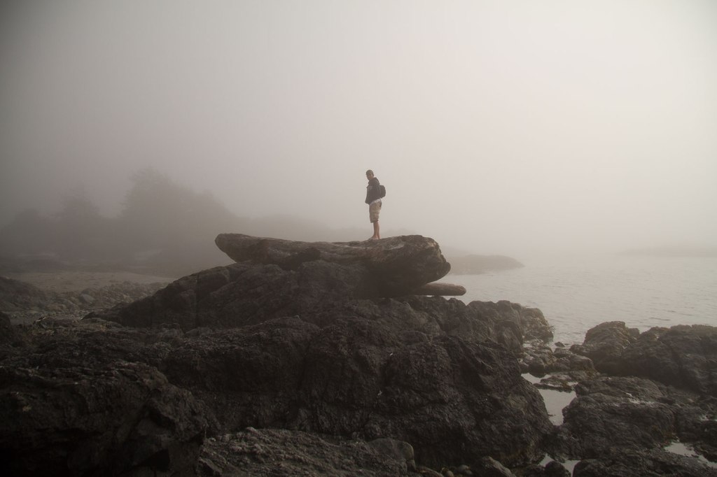
    The mist created a very cool effect; there was little to no definition in the day at all. The tide was out and the ocean seemed so far away.

    IMG_9884

    There was a shot I took that day that has always felt kind of magical to me. It’s a picture of the sand and the ocean and the sun, but so very different from the way we typically imagine sand, ocean and sun. Rather than powerful blues in the sky, a blazing sun, warm brown sand and an ocean going through all the blues and greens we expect, I saw this:

    IMG_9925

    I forgot about the shot and moved on. But lately I’ve been experimenting with grey, and in my search for the perfect grey (not too cold, not too slate, not too dark… grey is more complex than you’d think!) I remembered this colourless day. Little-to-no details in the world, defined by shadows and shimmers and little else.

    3V8A9406

    “Mist” is the result. A gentle semi solid that will show up detailed patterns as beautifully as stockinette and is warm and silvery, without feeling flat. I went through several grey iterations before hitting the right mix, and there are so many dyes in here to make this shade. There is taupe, black, grey, brown, gold …. we’ll definitely need to make big batches of the dye now that we’ve nailed the recipe.

    IMG_9839

    I am in love, and Mist will be joining the permanent collection in our next shop update, scheduled for November 1st. It will include Mist, the holiday pop up (Sugar Plums) and a few other goodies (TBA).

    3V8A9407

    Some people would have decided that the day was too cold and wet and glum for a walk along the beach, and eschewed the idea in favour of a fire, a hot drink, a good book. These things were tempting us that day, but we are photographers, and that means that we pursue those unique conditions of light that can redefine a typical scene and make magic out of the ordinary. I was very grateful for the gifts we got on that morning walk, and I hope you enjoy the new yarn as much as I enjoyed making it.


  • Living Yarns

    This autumn we wanted to do something a little different to celebrate the coming of cooler weather. These past few weeks you might have seen some yarns with a slightly different flavour showing up on instagram; instead of having our photography inspire the yarn, we’ve brought real, natural items into the dye station with us and used them to direct our dyeing process. Each item was part of a carefully curated collection of living things.

    When the yarn was done, we staged photography of the finished yarns with their living inspirations. The result is a collection of  7 gentle yarns, all of which will launch in our online store on September 15th.

    First up; Wine Grapes.
    These grapes were gifted to us from Frogpond Organic Vineyard in Niagara on the Lake. The colour is a deep, slightly variegated blue. Not too saturated, not too navy, just rich blue with black flecked throughout.

    3V8A8769

    Birch
    Birch was pure delight to work with; this colour is so subtle and yet so nuanced. Beige doesn’t seem to cover it, there are black flecks, shades of warm grey and an almost rusty/peach tone to cover the oxidized areas of the branch where to bark has come away. Anything but boring, this neutral was made for sweaters and accessories.

    3V8A8836

    Succulent
    This one could get confusing because we also have a tonal named succulent, and indeed we did try this colour as a tonal as well. As lovely as that tonal was, the gradient won the day. Softer than our usual gradients this gentle colour will shine on shawls! Succulent plants are such a wide world, we really enjoyed seeking out the right plants for our shoot.

    3V8A8897

    Quill
    Quill is the most variegated of the lot and a personal favourite. The feathers are from a turkey and the yarn attempts to evoke all the shades of brown, beige, deep almost blue-black and pale, warm grey while remaining wearable and workable.  The result is a rustic yarn that’s anything but shy.

    3V8A8663

    Cabbage
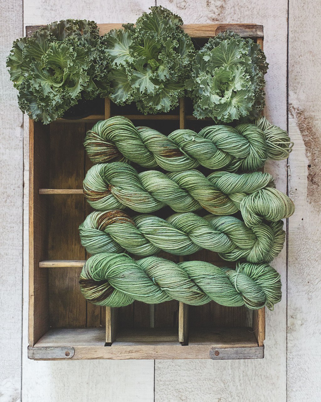
    “Do you really want to name your yarn after a vegetable no one likes?”. Such were the words of a close friend when she saw this photo. She raises a valid point, but once I saw these small ornamental cabbages in the nursery I knew I had to do something with them! Slightly bluer than grass-green, flecked with brown, blue and gold throughout, this will hopefully redefine how you feel about green yarn, and maybe even about cabbages, too.

    3V8A8939

    Flora
    Pink is not normally my jam. As another close friend said, The Blue Brick has a “look” and these light, floral tones don’t normally fall within my zone. However, once we were done we stepped back and thought “here’s a pink I can wear”. Gentle and nuanced with purple and coral, this semi solid yarn would be great by itself or in a fade.

    3V8A8788

    Nest
    Nest was the yarn that started us on this journey. My dear friend Kim (of Kim’s Barn!) gave us these lovely farm-fresh eggs. I marvelled at the variation of colour that her chickens could produce and the gentle egghshell vibe I got from them. This colour could also be expressed as something I have yet to do; a fade set. The eggs beg to be made into a palette for a larger project, do they not? Perhaps I’ll try.

    DSCF3072

    This collection will launch September 15th. Whether it’s a pop up or a permanent addition remains to be seen; we’ve been over our heads lately (as you know if you’ve been waiting for yarn) and I want to keep it manageable for us. If it becomes permanent it will be at the cost of other colours which will have to retire. Its a tough decision and not one I’m ready to make right now, so for the moment I’ll pile up on these colours for the upcoming Kitchener-Waterloo festival and prepare them for online sales come mid-month. You’ll be able to order any quantity you like, in any base, when the colours launch.

    We enjoyed this series and the challenges that came with it; subtle colours, nuanced tones, softer, gentler changes than we’re used to. The results are so wearable, lovely and versatile. I hope you’ll enjoy them as much as we do.


  • Compare Function on our site

    We’ve added a small, but useful function to our website that will help users coordinate different colourways, both tonal and ombre.

    1. On any product page you will now see two tiny buttons on the left.

    1

    2

    Click “Add to compare” to save the product to your personal collection. When you are ready to view all the products together, click on the “Compare Products” button below.

    3

    Now you can see them all side-by-side – handy for building fades or multi-skein projects, or seeing how a particular ombre works with a particular tonal.

    Hope you find it helpful – always feel free to send us your feedback!

  • Rebrand!

    You may have noticed some watercolour’esqu teasers on our instagram – it’s not watercolour, in fact, it’s acid dye! The same dye we use on our yarns.

    Untitled1

    I had quite a bit of fun, painting onto watercolour paper using dyes. Afterwards, I took the “splotches” that I liked most and shot them, then vectorized them (for you marketing types). I then took my favourite of the lot and designed our new logo!

    Screen-Shot-2018-05-07-at-12.19.10-PM

    Tada! Look for our new branding starting to make its way slowly onto ball bands and website collateral over the next few weeks. Why a rebrand? There were a few reasons; I wanted something recognizable and original, that hearkened back in a very direct way to what I love doing most; putting colour on things. I also wanted new colours as our signature look, because I wanted to design a signature colourway to go with it, introducing a colour simply called “The Blue Brick”.

    3V8A6431

    This colour has replaced Iridescent (they’re a little close). It’s a rich tonal that lives in the same space as the new logo; deep sapphire, violet turquoise and just a little hint of green.  It also is evocative of one of our favourite hobbies; chasing the Northern Lights, which makes it very us.

    img_6082

    Of course it also comes in silk, another reason for “dyeworks” instead of “Inspired yarns”.

    3V8A6428

    That’s my big announcement :) Hopefully you enjoy the new colour as much as I do! We’ll have a giveaway on our instagram feed to promote the new look; follow us there for details!


  • Country House Knits

    By now you’ve probably seen the buzz on instagram – our new book is finally ready to share with the world and we couldn’t be happier with the results!

    Country-House-Knits_Lookbook-1

    Country House Knits has 88 pages of lovely photography, and 14 patterns in both written and charted form. This time we released our lookbook as a separate pdf – to help people decide what yarn they need, what patterns they’re interested in, and what the skill/yarn requirements would be.

    Click here to view our free lookbook!
    Click here to purchase a pdf ebook
     & Click here to order a printed book + the ebook

    Here’s a preview of what’s inside :)

    Country-House-Knits_Lookbook-2

    We had so much fun with the photography for this; we remodelled a corner of our dining room as a staging area and shot the entire book in one small corner.

    3V8A4957

    Of course the pups made an appearance :)

    3V8A5098

    I’m working now on getting the individual patterns uploaded to Ravelry as well, more info on that coming this weekend!

    Thank you to everyone who has followed our little journey with this book. It felt so good to go to print this morning. I couldn’t have done it without a spectacular test knitting and technical editing team. I can’t wait to see what you think!

    Psst. In a few days we’ll do a contest and giveaway for printed copies – follow me on instagram to stay in the know!


  • Aloha! The Hawaiian Yarn Series and a Blue Brick Luau!

    One of the things we learned in Hawaii is that “Aloha” doesn’t just mean “Hello”, as I previously thought. According to wikipedia:

    Aloha (pronounced [əˈlōˌhä]) is the Hawaiian word for love, affection, peace, compassion and mercy, that is commonly used as a simple greeting.[1][2]

    I love this. I love that this multifaceted word means so many good things! I thought about Aloha while designing these yarns, and I hope, respectfully, that I managed to include some of that spirit in both the yarn and photography. These colours will be added to our line permanently starting Friday. They will each replace something, so if that something is a favourite of yours, you will have two days to place an order.


    These new colours will also be at the Knitters Frolic on April 28th (Booth 31, Shokokai Court), and if you’re local to us we’d love to have you at our Hawaii Colours/Book Launch Luau! Yes! We are throwing a Luau at Spin Me A Yarn and I couldn’t be more little girly-excited about it. We’re going to have flowers in our hair and leis around our necks, there will be Mai Tais, spiked fruit punch and possibly even a pig roast (failing that, pizza with pineapples… but I’m almost certain we can do better). There will be new colourways, copies of the new book, kits for all the new patterns, and of course prizes and giveaways! Save the date: Friday May 11th.


    Coastline – Replacing Torii

    Coastline is soft and tropical and warm, though made of blues, greys and slates. Variegated with brown and moss-toned speckles, it’s a fun colour for pretty much any project, including sweaters. It would go beautifully with Seafoam or Bauline if you’re looking to pair it with something.

    Untitled-2

    Here’s coastline in context with a few other colours, from left to right: Cobblestone, Muddy Husky, Coastline, Seafoam and Bauline.

    3V8A6153

    Caldera – Replacing Ocean Fortress

    Replacing Ocean Fortress was a hard and scary decision, it’s been a favourite for a long time and it’s our oldest existing colour. However, you can approximate it by combining Willow and Iceberg, so it was also a bit redundant. I hope the new colour makes you just as happy :)

    Caldera is based off perhaps the most dramatic photo of the trip; the Milky Way emerging over Kilauea’s caldera lava lake, and shot through the trees. Rich, hot yellow changes to a mild lilac tone and then descends into deep blues. On sparkle yarn it’s especially yummy, and we’ll definitely have sparkle bases at the Knitter’s Frolic!

    Untitled-22

    Kilauea – Replacing Gerber Daisy

    This is the last of the Hawaii Series, though not the last of the colour substitutes (read on). Kilauea is a very rich colour, going from fire tones through to deep blues (from the metallic flashing that you get on cooled lava as minerals are leeched to the surface) and then a solid black. It’s a daring colour, a committed colour, and has all the drama it deserves for a photo where I literally melted my sneakers.

    Untitled-23

    Next up are colours that are not from Hawaii, but are being added to our permanent line. First up is “Storm” – which is “Overcast” by another name. I loved the denim blues too much to let them go. “Storm” is going to replace “Sundown”.

    Untitled-24

    Last one – you may have seen this colour sneaking around on Instagram and in the “Country House Knits” book work. This is “Stucco” shot off a wall in the south of Spain making it, quite literally, a Spanish Yellow.

    Untitled-3.jpg

    Stucco has already been used in a few projects, and it works up beautifully.

    3V8A4957.jpg

    That’s it for new colours for 2018, with the exception of our pop-up series colours, which may or may not continue through the summer as we enter festival season. I hope you’re as excited about them as I am! I hope we will see you at the Frolic and also at our Luau this spring. Lots of great things in the offing :)