• Everyone who knows me knows that turquoise, browns and blues are my colours. Every time I walk into a yarn store I am lamentably predictable. But then… then I picked up this lovely thing.

    Tanis Fiber Arts Iris

    This is Iris, one of the new colours from Tanis Fiber Arts. I picked up a skein in her blue label sock yarn and I am in love. It’s beautiful and punchy, and more variegated than I typically go for, so the question now is, what to do with it?

    I’ve considered Jane Richmond’s lovely Strathcona:

    Strathcona

    And Martina Behm’s Lintilla:

    Lintilla

    I have never knitted either of these patterns, though I have done patterns from both designers before and I know I love their work. Both these patterns are simple enough that the textural pieces will allow the variegated yarn to shine, and both are great summer pieces.

    But I am totally open to suggestions too! Anyone know of a great pattern for 400 yards of sock yarn that will show off these colours they way they deserve? Of the 2 above, which one would you vote for?

    Tanis Fiber Arts Iris

  • I still haven’t processed all the photos from our trip to El Salvador… but I did finish the Salvadoran knitting. Introducing Yolanda’s Henslowe:

    Henslowe ©Shireen Nadir 2013

    Every time I make one of these I think ‘these shawls go fast!’ and I always forget that bloody picot bind off. This time I got hung up enough on it to calculate – I spent 4.5 hours on the bind off, which is more than a third again of the time it took to make the shawl. However… there were a few things that made this alright this time around… more than alright really, for a start, most of it was done here.

    El Tamarindo ©Shireen Nadir 2013

    And then there’s the fact that the results are so, so worth it.

    IMG_7481

    The yarn is Tanis Fiber Arts Silver Label Mulberry Silk, 550 yards, and a-one-of-a-kind skein that I picked up at my first ever knitters frolic and have been hoarding since. Nothing could be special enough for this skein.

    But then…Tito told me that his mom and I have the same favourite colour. His mom, who I never get to see because she lives in Winnipeg, who treated me with such warmth and kindness on the one occasion I got to meet her. Yes, his mom deserved something lovely from this precious skein.

    Untitled1

    And of course, Tito’s mom is from El Salvador. Where better to knit her shawl?

    Henslowe ©Shireen Nadir 2013

    I made a few alterations to the pattern (Beth Kling is great by the way, and very helpful). I increased until I had 60 yarn overs, and worked 5 repeats of her Roman Stripe pattern before beginning the bind off. One skein of TFA Silver Label goes a long way and I wanted to use up every last inch if I could. I love the final size, 55″ across and 17″ deep.

    IMG_7499

    I hate it when you cast off a shawl and it’s so tiny, even after blocking, that it sits awkwardly on your shoulders like the funny little wings of newly hatched butterflies…but the pattern increases here resulted in a generously sized shawl.

    IMG_7483

    Many thanks to my effortlessly beautiful model Leslie for helping out with the FO photos :) Ravelry project page here:

    Oh, and in between knitting? I took baby steps in surfing ;)

    IMG_6098

  • So I made these lovelies on the weekend :)

    ©Shireen Nadir 2013

    All supplies from Beadfx.

    • Open lever backed earring closures
    • Silver finish hummingbird charms
    • 3mm round Swarovski crystals in colour ‘denim blue’
    • Ball point head pins
    • Swarovski Elements Rhinestones – 12 mm Rivoli Cut Pointed Back Foiled Rhinestone
    • Silver Stone mount Rivoli


  • This hat was designed for my friend Johnathan to be a man-hat that’s actually fun to knit :) Enough cable to be interesting, while still being sufficiently manly for my Scotch-Irish friend who loves Celtic cable-work.

    Johnathan Hat © Shireen Nadir 2013

    This close fitting cabled touque features a celtic cable up one side, framed by tapering columns of ribbing that blend into the brim of the hat. It’s a quick, easy knit, suitable for beginner cable knitters. The decreases are arranged to lie symmetrically around the cable panel for a balanced look.

    Johnathan Hat © Shireen Nadir 2013

    The cable pattern, tapered sections and decreases have been charted as well as written and the hat requires 160-180 yards of DK weight yarn. The hat in the photos was knitted using Tanis Fiber Arts Yellow Label DK in the relatively new colourway ‘Spruce’. Tito gravitated to it at once when he saw it – I wonder if that colour was one of Chris’s creations? Definitely man-approved, but still luscious to knit with. Win.

    Johnathan Hat © Shireen Nadir 2013

    I’ve also worked one up in Zen Garden Serenity DK, in the ‘moss’ colourway. It’s a great alternative if you’re looking for a solid piece.

    Johnathan

    I’ve provided instructions for medium and large. Medium fits a head circumference of 19”-21”, and large fits a head circumference of 20”-22”, but the hat is very stretchy and will fit a variety of folks :)

    Ravelry Pattern Page here:

    Etsy Page here:

    Craftsy Page here:

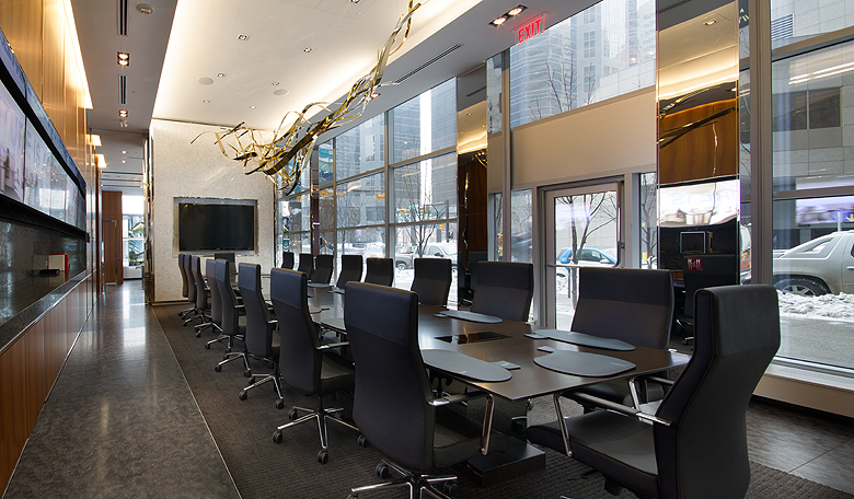
  • 2 weeks ago I flew to Calgary to shoot a sales centre my agency had helped design. It was a great shoot; a challenging space with lots of monitors and lots of glass. The white balances were all over the place, and the monitors, windows and pot lights meant lots of light sources to contend with.

    This post is about my mental work flow when I’m doing this type of shoot. I won’t get into the photoshop details too much – this is more to show how I analyze a shot so I can get the best results.

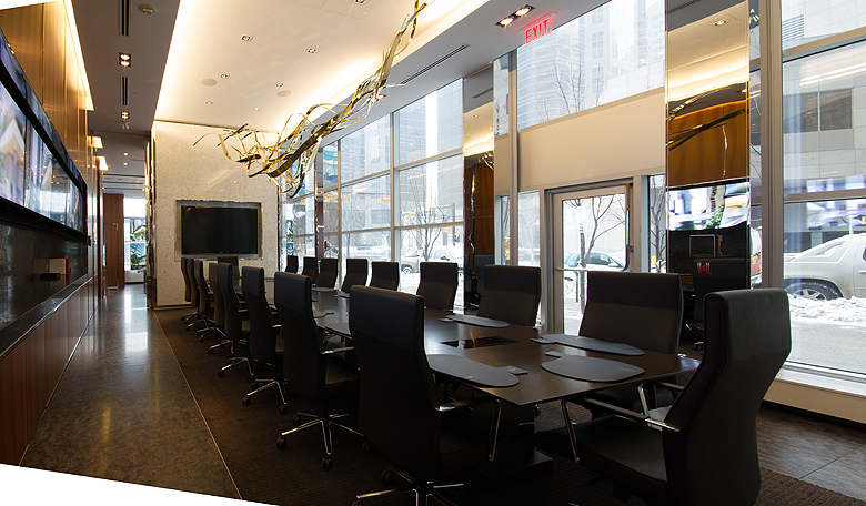
    Here is the original:

    ©Shireen Nadir 2013

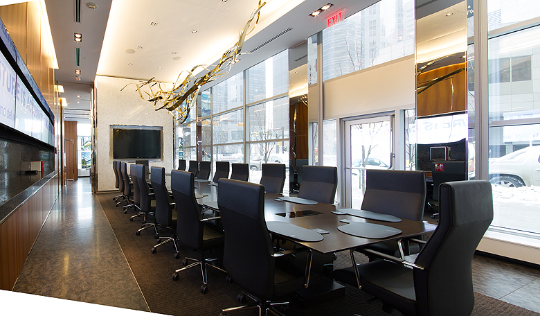
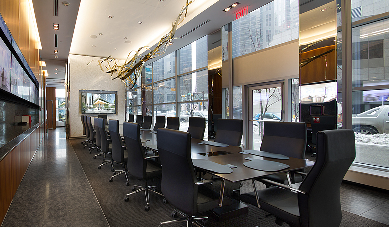
    And after processing:

    ©Shireen Nadir 2013

    Step 1

    I used the free transform tool to straighten out the walls. I used guides to make sure everything looked right.

    ©Shireen Nadir 2013

    Step 2

    I had shot 3 exposures. I used the lighter one on top with a layer mask and selectively painted in with a semi-opaque brush to lighten up the darker areas.

    ©Shireen Nadir 2013

    Step 3

    A levels adjustment layer was used to get the detail under the chairs to come out.

    ©Shireen Nadir 2013

    Step 4

    I had to darken the view outside because it was blown out. This is where the darkest of my exposures came into play. Again I applied a layer mask and used a semi-opaque brush to paint in the darker exposure where I needed it.

    ©Shireen Nadir 2013

    Step 5

    Using the vanishing point filter I established a perspective grid for the areas that were left blank by my wall straightening. Then I rubber stamped within that grid to fill in the corners without losing the perspective.

    ©Shireen Nadir 2013

    Step 6

    I duplicated my layer, set it to multiply and applied a layer mask. Then I used a semi-opaque brush to paint in the highlights on the floor and table, to dim them a bit.

    ©Shireen Nadir 2013

    You can already tell I use layer masks and adjustment laters A LOT. I believe in non-destructive editing, this is very handy if the client has comments, and allows you to go back to any stage in your process to make adjustments (or create blog posts ;) ) I also rely heavily on my graphics tablet for detail work.

    Step 7

    The tungsten lighting in the room was making the floors and carpet come out orange. I created a new layer, set its blending mode to colour and painted the floor and carpet a neutral grey.

    ©Shireen Nadir 2013

    Step 8

    I did the same for the back wall and ceiling area, to lessen the effect of the tungsten lights. I was, however, careful to paint around the art piece on the ceiling, so it’s gold colour wouldn’t be affected. Removing the orange tone from the white wall helped this piece pop out more.

    ©Shireen Nadir 2013

    Step 9

    The overall tone was just a touch too bright for me. I used apply image, multiply at 10% to bring it down a touch.

    ©Shireen Nadir 2013

    Step 10

    The monitor at the end was off so I put an image in.

    ©Shireen Nadir 2013

    Step 11

    The screen didn’t look realistic yet, so I added an adjustment layer of levels to just the screen and increased the brightness and contrast. Then I added a slight outer glow using layer styles.

    ©Shireen Nadir 2013

    Step 12

    Finally, I duplicated the monitor, turned it upside down, applied a layer mask and painted in just a little detail onto the table as a reflection. I added a gaussian blur to the reflection to make it more subtle and realistic.

    ©Shireen Nadir 2013

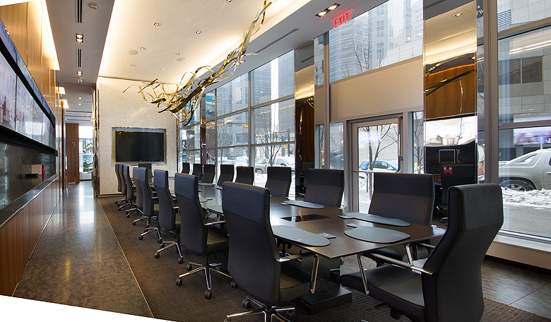
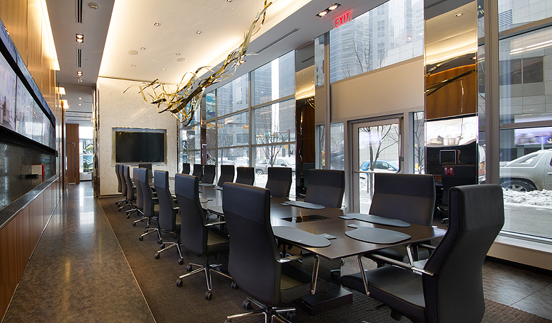
    Here are the before and after again :)

    ©Shireen Nadir 2013 ©Shireen Nadir 2013

    A lot of this is my personal taste, but knowing my work flow helps me determine how to shoot. I ask myself questions like

    • Do I need multiple exposures?
    • Do I need multiple white balances?
    • Do I need a polarizer filter for the reflections?
    • Are the walls bending with my wide angle lens? If so, should I do it in one shot or stitch it?
    • Would this shot benefit from a graduated filter?
    • Do I have any ‘hot spots’ that I’ll need to take out later?
    • Do I need to add anything (Like that monitor)?

    This helps me create a shot that, though heavily processed, looks realistic, maintains the subtle details and allows me to deal with complex compositions.

  • Heading home in the morning and very reluctant to say goodbye to El Salvador! Expect lots of photography when I’ve had a chance to settle in and process :)

    Until then though, I leave you with this lovely discovery. This is a Michelada.

    20130316-225136.jpg

    Our lovely friends, Quique and Bertha-Alicia introduced us to this treat tonight. It’s tasty, spicy and utterly delightful :)

    Here’s what about.com has to say about making one:

    Ingredients:

      1 ice cold Mexican beer (dark is better)
      coarse salt (for the rim)
      1/4 cup fresh lime juice
      1-2 dashes of hot chile sauce (such as Tabasco, Tapatio or Cholula)
      1 dashes of soy sauce
      1 dashes worchestshire sauce
      beer mug or large glass (chilled if possible)
      Ice
      lime wedge for garnish

    Preparation:

    Salt the rim of the glass by wetting the edge with some of the lime juice then dipping it into a plate with salt on it. Now fill the glass about half way with ice and pour in the lime juice, chile sauce, soy sauce and worchestshire sauce. Mix with a spoon then slowly pour in the beer to the top of the glass. Push the lime wedge onto the edge and serve immediately.

  • Of much knitting. And sleeping. Oh, and I’ve taken up surfing (if riding a wave on your belly counts)

    20130315-215210.jpg

  • Just a quick note to show you this fabulous place :)

    20130312-113808.jpg

  • It’s funny how attached you can get to an inanimate object – our ancient beleaguered Corolla died on the weekend and we’re pretty damn sad about it. We got that car with 114,000 clicks or so, and over the next three years we added 200,000 clicks of our own.

    DSCF1279

    It’s taken us all over southern Ontario, Tobermory, Sudbury, Terra Cotta, Mono Cliffs, Cobaconk, Kilarney and Merrickville, to name just a few.

    Pedro has chased lightning…

    lightning10

    Braved winter storms…

    IMG_6230

    Gone off-roading…

    IMG_3134

    Performed tripod duties…

    IMG_7536

    And carried us to many successful Aurora sightings.

    IMG_4372

    Pedro had the honour of carrying my best friend on her wedding day.

    IMG_1562

    The first year we had him was incredibly snowy… and we had to park outside. That car started, every morning, without fail, and never broke down until the day he made his last trip.

    IMG_4249

    200,000 clicks is almost 5 times around the world. He has carried our friends and family safely home through all kinds of weather. You can ask no more from a car than that.

    IMG_3126

  • I’ve been to every province in Canada except Saskatchewan. There is a joke in Manitoba that if you just look west you can practically see it; it’s that flat, but I’ve always wanted to drive through the prairies. I took this photo today while flying over Saskatchewan, and I love how the horizon line and the river are the only features in this table of white. I’ll bet the skies feel ten times bigger there.

    IMG_0125