 2017 was a roller coaster ride for us and I find reflecting useful, both for putting things in perspective and for moving forward. Here we go!
The company that I worked for these past 12 years changed dramatically, and I decided The Blue Brick was a better place for me. It was hard and scary and I miss free time and regular pay cheques, but The Blue Brick benefitted greatly from my presence full time. I never thought I would leave that job, but looking back I’m glad I took the leap.
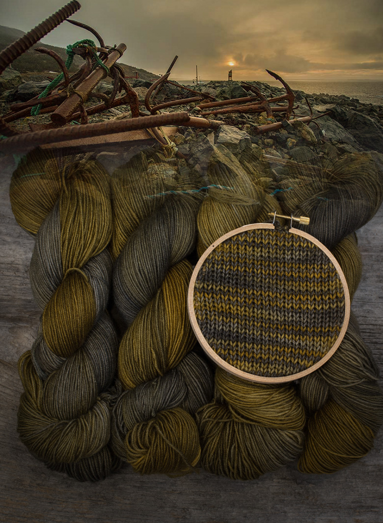
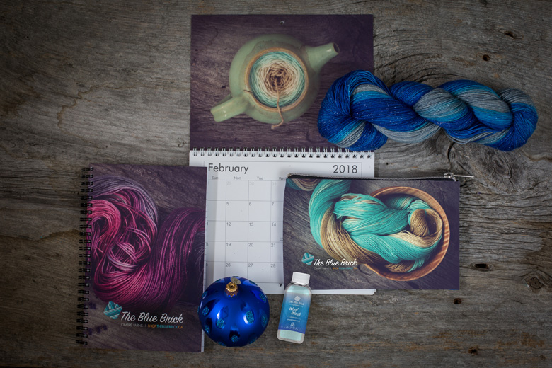
We launched Ombré Knits; our first pattern collection, started our pop-up colour line, developed and added a tonal line and hired our first two employees (including my dad! Yay for daddy time!).
We launched several patterns, attended lots of festivals and spent time out west at Vogue Seattle and Knit City, thanks to Valley Yarns and the Nifty Knitter.We expanded to the US and formed partnerships with lots of new Brick-and-Mortar stores across Canada. We received a write-up in Vogue Magazine, spoke at several guild meetings and met tons of new friends. We finished up with our first of what will hopefully be an annual tradition; The Blue Brick Holiday Party. It was a great year for The Blue Brick.
There was also loss. My father in law passed in November, after a long and courageous battle with cancer. Kali lost her father over the summer. Our family cat, Ollie, passed away last month. I am of mixed feelings about revealing this next bit, but I’m going to say it in the hopes that it’s helpful to someone to know that my life isn’t my instagram feed; this year I had two miscarriages.
Each miscarriage was followed by periods of depression, poor eating, anemia and sleeplessness. Orders were late, people were mad, and I was trying not to talk too much about it. I felt so many things, loss, guilt, like I was copping out, talking about it too much, (oh god, not playing the miscarriage card again!) and making a mountain out of a molehill. I felt like I was asking for sympathy, making people feel awkward and airing my dirty laundry. I felt the responsibility to care for everyone else’s feelings (How are they gonna react? Are they sick of hearing me complain?) instead of my own. I tried to hide it on a professional level, to keep my social media posts upbeat and happy, to not ask for more time on order fulfillment. I’m still not sure if that was even healthy, but that’s what I did.
I know someone who raises highland cattle and works three jobs to support her cows. I know someone who makes complex chainmail while suffering MS. I think all small business owners know what I’m talking about here, when it comes to loss, sickness and grief. We pour our hearts into what we do, knowing the sacrifice it takes. It’s hard to get time away and it’s easy to put our needs last.
“Be kind, for everyone you meet is fighting a hard battle.”- Plato/ Philo of Alexandria/anonymous
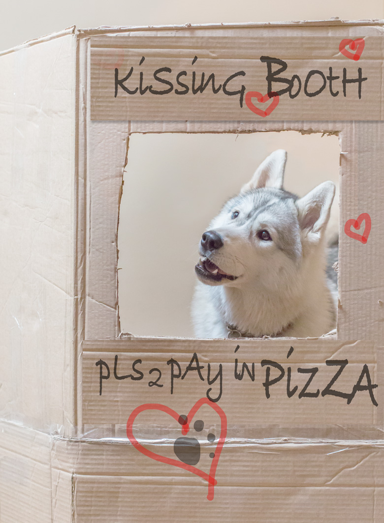
Sammy and Arya were the willing recipients of my pent-up maternal tensions. I poured all my emotion into yarn, and into Arya who was just a puppy and played a huge role in the healing process. Sometimes I just wanted to fling my phone across the room but instead I’d take a cute photo of her and post it online. Never, ever underestimate the healing power of animals.
Lest anyone think it was just a terrible year, read on!
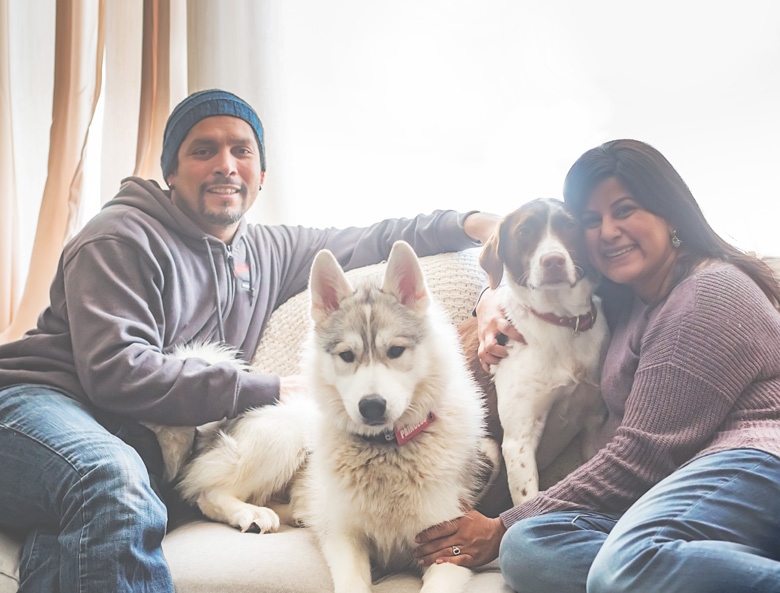
The greatest part of our year, no contest, was getting the girls. Sam and Arya are the loves of my life, and my babies in every sense that matters. Sammy’s journey in particular has been beautiful to watch and has made me feel that I have done something worthwhile to steward a little life, which is mama enough for me. I cannot imagine life without them.
Among other amazing people, I met Kali, a friend who has been there in countless ways already, even though we haven’t actually known each other a year yet! Brandt, Treena, Bob, Linda, Lindsay and Ruth, Annika and Susie, my entire weaving guild,*everyone* at the Nifty Knitter, I know I’m forgetting names here, but so, so many wonderful new faces in my life.
My parents moved to Burlington to be close to us and to support us, which has meant the world to me.
The summer rocked. We tried to be done with dyeing by about 3pm every day, which meant beer and burgers on the back patio, knitting and reading and napping and all kinds of long, warm, awesome weekday evenings. Every Tuesday mom comes over with fresh bones for the girls. We built a gazebo.
I joined the local weaving guild and took a weaving class with an amazing teacher; so I learned how to warp my 8-shaft loom at last! I’m so excited to see where my weaving adventure takes me.
A few weeks ago I received the unexpected message that, with enough training and commitment, I might be able to qualify for my Sandan (Third Degree Black Belt) this coming year. I was electric with happiness when I got the word, and immediately afterwards humbled, scared and uncertain, coming on the heels of my physical condition (or lack thereof) and poor performance in class. I don’t feel worthy, but I’m ready to work to get there, and come what may, I know I’ll try my best. I’ll post progress and training shots online!
This coming year we’ve got big plans. I’m going to start teaching dyeing workshops around the GTA and hopefully some of the festivals; tonal and ombré! I enjoy teaching and inspiring so hopefully I’ll get a chance to connect with some of you there.
Ombré Knits 2 is in the works; and I’m so excited about the patterns, which will leverage ombré and tonal together for exciting new projects.
Sammy is getting her own colourway and I’m hoping to start a fund-raising initiative for the Niagara Dog Rescue – more on that come Sammy’s homecoming anniversary.
My focus this year is community; I want to meet as many of you as possible, do KALs together, teach workshops, have knit nights, do guild talks and just generally feel more connected to the core group of knitters who have always gone out of their way to support us. You are my foundation, even if you don’t know it yet, and you are why we do what we do!
We wish everyone a healthy, happy, creative 2018 filled with peace, love and inspiration. We can’t wait to spend more time with everyone and make beautiful things together!
Thank you for reading <3
With so much love,
Shireen, Tito, Sammy and Arya