
Tag: tutorial
-
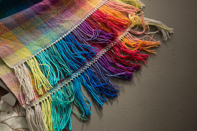
I created a second colour shifting scarf for Tanis, and I made some tweaks that I think really improved the design. I used a 10-dent heddle instead of 12 which greatly improved the drape and allowed me to warp to 80”, which meant that after I cut off the loom waste Tanis was left with…
-

In my latest design, ’Sandy’ the lace pattern is worked on both sides of the piece. This can sound intimidating, but working lace on the purl side is really quite easy, promise :) I shot photo tutorials for the pattern to help folks navigate the lace. On the front of ‘Sandy’ I use yarn overs…
-

A few people asked, after my post about the Colour Shifting Scarf, if I could share a tutorial on how I hemstitch my ends. I am by no means a weaving pro, so how I do it may not even be the ‘right’ way, but it works for me and I love how it looks!…
-

This months tutorials have been unfairly balanced so far in favour of polymer clay, so here is one for a super cute knitted slouch hat. This one works up very fast, without too much shaping, and is ideal for beginner knitters. The simple knit-purl design is patterned on every row, but the results are super…
-
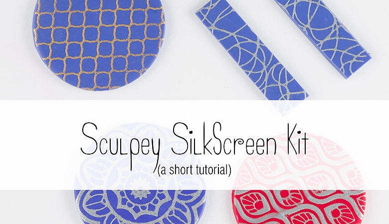
I’m sure by now you’ve noticed a theme for the Blue Brick this month–as a Christmas gift to my readers I’m trying to post nothing but crafting tutorials until Christmas day! I wanted to go for 12, but that might have been a bit ambitious ;) Here’s number 4! This tutorial covers the Sculpey Silkscreen…
-

Of course, resin had to be an installment in my holiday-related crafting tutorials, and I honestly think they’re the prettiest ones yet (I’m biased though!). Tito and I made these for our vets, to thank them for the awesome care they have shown our diabetic kitty this year. You will need: Contact (sticky) paper A…
-
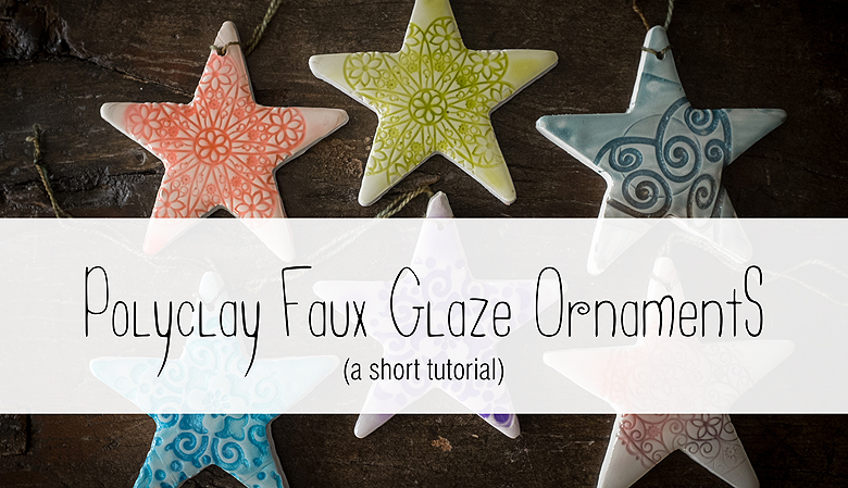
Continuing on with my Christmas theme, I wanted to share a tutorial on another method for making polymer clay ornaments with a completely different look-faux glazed pottery. This is super simple, fun, and the results are so pretty! You will need: Alcohol inks Fimo liquid clay White polymer clay (I’m using Sculpey) A pasta machine,…
-
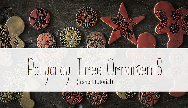
Today I wanted to share a super simple technique for producing gingerbread men tree ornaments! Tito and I will be giving these to our friends as stocking stuffers this Christmas, but they also make very cute gift tags. You will need: Polymer clay (I’m using Sculpey III, colour ‘gold’)* Talcum powder Cookie cutters Inka Gold…
-

Using resin to create a faux enamel effect is super easy, and once you get the hang of it you can mix virtually any colour you want and use it for all kinds of fun applications. This is a very simple project to make adorable fake enamel earrings. If you enjoy this tutorial please consider checking out…
-

Tito and I bought a shoe rack/bench from IKEA for our front hall a few months ago. It’s a nice rack, but it was missing that element of quirky creativity that defines our home, and last night we decided it would be fun to add a customized, cushioned seat cover. It’s super easy, here’s how…
